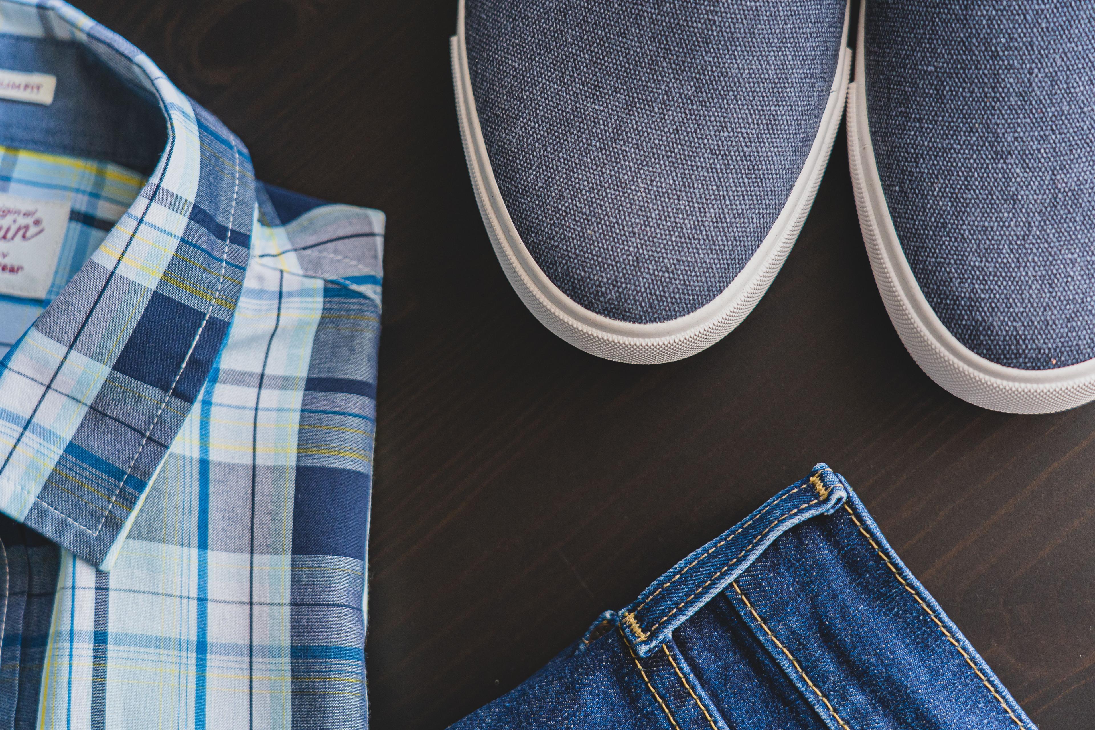
The Hidden Language of Color in Brand Photography
Imagine walking into a local coffee shop.
The background features dark oak shelves and a warm brick wall. The barista wears a clean navy apron over a cream sweater. A simple brass kettle sits on the counter. You immediately feel calm. You expect to pay six dollars for a handcrafted drink, and you pull out your card without thinking twice.
Now imagine walking into a shop next door.
The walls are neon green. The barista wears a bright red shirt. A neon orange plastic tray sits on a metal table under flickering white lights. You instantly feel rushed. You expect cheap drip coffee, and you check your watch.
Neither shop said a single word to you. You did not read their menu. You did not talk to the owner. Yet, your brain made up its mind about their prices, their quality, and how safe you felt spending money there.
That is color psychology in real life.
When future clients land on your website or scroll past your social posts, their eyes process color long before they read your text. You rarely have total control over a studio wall or a rented location. You cannot always repaint a room for a photo session.
The magic happens in how you combine every piece in the frame. The clothes on your back, the items on a shelf, the notebook on your desk, and the wall behind you all work as a team.
When those pieces fit together, you look like a steady professional. When they clash, you confuse people. Confused buyers do not hire you.
Let us look at how to pull these pieces together so your images do the heavy lifting for your business.
The Guide, The Hero, and Color Balance
In good business storytelling, your client is the hero. They have a problem they want to solve. They want to hire a guide who can help them win.
To trust you as their guide, your client needs to feel two simple things: warmth and competence. They need to know you get results, and they need to feel comfortable working with you.
Color gives you a fast lane to those feelings. It skips logic and speaks directly to human instincts.
Most service businesses want to build one of three specific feelings:
Trust and Stability (Calm, safe, reliable)
High Value and Quality (Premium, polished, top tier)
Energy and Action (Bold, creative, fast moving)
If you pick colors at random, you create visual noise. If a quiet financial planner wears a bright red suit in front of a busy yellow bookshelf, clients feel stressed. If a personal trainer wears a dusty gray shirt against a plain beige wall, clients feel bored.
Matching your color mix to your brand promise makes your offer make sense.
The Three Layers of Every Brand Photo
To pull off a great look, stop looking at your background as just a wall. Think of your photo as three distinct layers that talk to each other:
Layer 1: The Environment. This includes the backdrop, painted walls, art prints, open shelves, and large furniture.
Layer 2: The Outfit. This includes your top color, pants or skirt, shoes, belt, jacket, and jewelry.
Layer 3: The Supporting Props. This includes mugs, pens, notebooks, laptops, chairs, or tools of your trade.
When you treat these three layers as one complete palette, you take control of the entire image. Even if a backdrop wall is a plain color you did not choose, you can balance it with the right outfit and prop choices.
Let us look at three proven color combinations you can use right now.
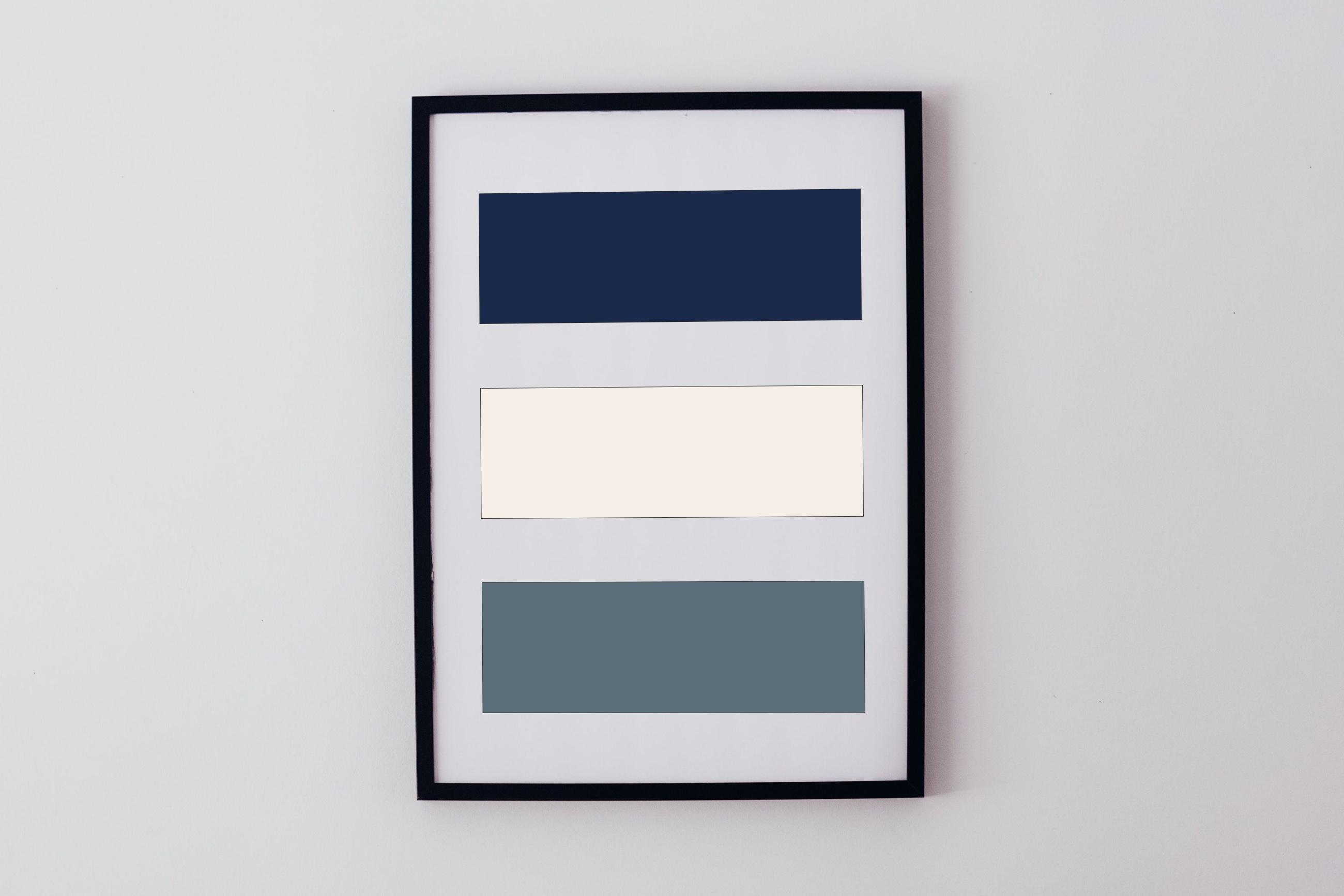
1. The High-Trust Combination: Navy, Warm Cream, and Slate
If you are a coach, consultant, therapist, lawyer, or real estate agent, trust is your main asset. Clients bring you big problems. They want to see that you stay steady when things get tough.
How to Mix the Layers
Environment (Layer 1): Look for a room with warm wood shelves, a soft cream wall, or a light gray backdrop. Neutral art prints or a quiet bookshelf work well here.
Outfit (Layer 2): Wear a structured navy blazer or sweater over a soft white or cream top. Pair it with dark denim or charcoal pants. Keep jewelry simple, like matte silver or simple gold studs.
Props (Layer 3): Grab a stoneware mug in slate gray or cream. Use a plain brown leather notebook and a simple black pen on a clean wooden desk.
Why This Combination Works
Navy signals logic, clear thinking, and safety. Warm cream softens the navy so you do not look like a corporate robot. The warm wood in the background or props adds human warmth.
The combination tells your client's brain, "This person knows what they are doing, and I am safe in their hands."
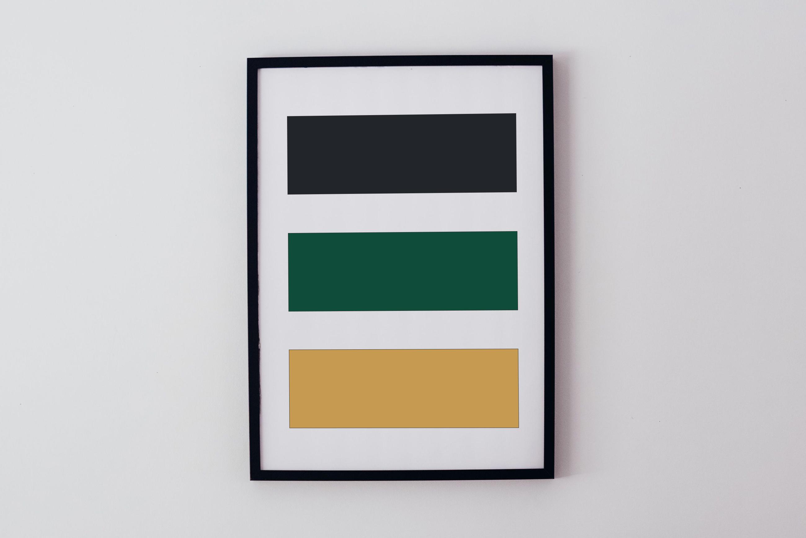
2. The High-Value Combination: Charcoal, Deep Emerald, and Warm Brass
When you sell a premium service, you do not win by being the cheapest option on the block. You win by showing exceptional care and focus. Luxury visuals tell clients you care about details others miss.
How to Mix the Layers
Environment (Layer 1): Pick a space with dark wood paneling, a rich charcoal accent wall, or a dark moody office corner.
Outfit (Layer 2): Wear a deep emerald green top, a rich burgundy sweater, or a fitted black jacket. Add subtle metallic accessories, like a classic watch with a leather band or a thin gold necklace. Dark dress shoes or clean leather boots anchor the look.
Props (Layer 3): Put a glass water carafe or crystal tumbler on the desk. Use a dark leather portfolio or desk pad. Keep a fountain pen or metal stylus nearby.
Why This Combination Works
Darker tones combined with rich jewel colors create depth and visual weight. They cut out background clutter. When you place small metallic accents next to deep colors, those highlights pop off the screen.
This mix tells your client's brain, "This experience is custom, refined, and worth every dollar."
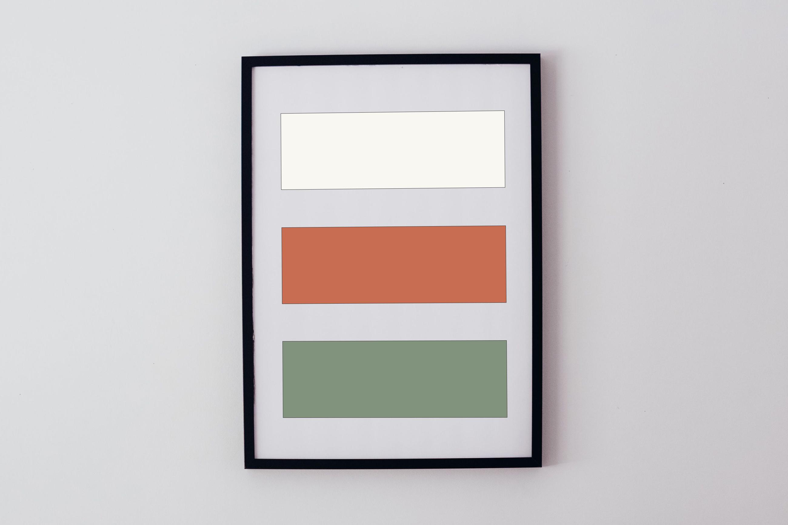
3. The High-Energy Combination: Soft White, Warm Terracotta, and Sage
If your brand centers on creativity, quick progress, bold ideas, or personal fitness, quiet corporate colors will slow you down. You need visuals that feel alive.
How to Mix the Layers
Environment (Layer 1): Choose a bright space with plenty of natural daylight coming through large windows. Light oak flooring, white walls, or open white shelving give you a clean slate.
Outfit (Layer 2): Wear a warm terracotta, rust, or warm mustard top paired with light wash denim or cream pants. Wear comfortable white sneakers or casual brown leather shoes.
Props (Layer 3): Bring in a bright green potted plant like a monstera or ficus. Use an iPad with a stylus, or put colorful sticky notes on a clear glass board.
Why This Combination Works
Bright white environments let natural light bounce everywhere, which feels open and clean. Terracotta and sage green add organic warmth so the image does not feel like a sterile hospital room.
This mix tells your client's brain, "Working with this person is fresh, active, and full of momentum."
How Contrast Directs Your Client's Attention
Color does more than create a mood. It directs where people look first in a photo.
Human eyes follow a very simple rule: they lock onto the spot with the highest contrast and the brightest color.
If you wear a plain black shirt and stand in front of a black wall, your head looks like it is floating in space. If you wear a bright neon yellow scarf, your client looks at your neck instead of your eyes.
Your face needs to be the star of every brand photo. Your clothes, backdrop, and props are supporting players.
Here is a quick reference table to help you build balanced layers:
Target Feeling | Layer 1: Backdrop & Furniture | Layer 2: Outfit & Accessories | Layer 3: Props & Objects |
|---|---|---|---|
Trust & Calm | Light gray wall, warm wood shelves, soft art prints | Navy blazer, cream top, dark pants, simple silver watch | Stoneware mug, brown leather journal, simple pen |
High Value & Prestige | Charcoal backdrop, dark espresso desk, deep shadows | Emerald sweater or black suit, gold chain, dark boots | Glass carafe, leather desk pad, metal pen |
Energy & Action | Bright white wall, big windows, light oak desk | Terracotta top, light jeans, white sneakers | Potted green plant, tablet with stylus, colorful notes |
Three Common Color Mistakes That Lose Sales
1. Blending Straight Into the Backdrop
If your shoot location has a dark brown brick wall and you show up in a dark brown jacket, you vanish into the background. Always pick an outfit color that sits a step lighter or darker than the wall behind you. You want clear separation between yourself and the room.
2. Ignoring Your Website Palette
Your photos do not live in a vacuum. They end up on your home page, your landing pages, and your sales documents.
If your website uses soft muted earth tones, but your photos feature bright neon clothes and dark moody shadows, your site looks broken. Your photo colors should match the main tones of your website branding.
3. Let Props Steal the Show
Props should add context to your story, not pull focus away from you. If you hold a bright red coffee cup with a giant corporate logo, that logo becomes the main hero of the photo. Stick to plain, solid props without big text or bright patterns.
Simple Steps for Your Next Shoot
You do not need an expensive set or a total wardrobe makeover to fix your visual message. You just need to plan your layers before you step in front of the camera.
Pick the main feeling you want to create. Do your clients need safety, luxury, or energy?
Look at your shoot location. What color is the backdrop wall, the flooring, or the main furniture?
Choose an outfit that stands out from that room. Make sure the outfit matches your target feeling.
Add one or two simple props. Make sure the prop colors lock into the overall palette instead of fighting it.
When your backdrop, clothes, and props speak the exact same language, your clients feel it immediately. You look like the clear choice before they ever read a single word of your copy.
A lot of this is likely very complex to take in from a simple blog post. If anything, hopefully this just helps you start thinking about color and how it all can tie together in a harmonious package that allows you to better tell your story.